$0.00
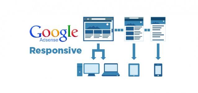
What is a responsive website?
Responsive websites are designed differently for all devices. For example, a website on your laptop should appear differently on an iPhone or iPad. Resizing & redesigning the content & layout of a website per device, ensures ease of reading, navigation and an all round better experience for the user. If your website looks the same on desktop and mobile, your site is not responsive!
What’s changing?
Google currently provides recommendations to web designers and developers so that they can optimize websites for Google’s search engine algorithms and for SEO purposes. As of this month, Google have changed their algorithm that ranks websites in the Google search engine. This change effects the Google Search Ranking of non-responsive websites. Businesses whose websites are not responsive on mobile devices, will have their SEO hit hard and may find themselves dropping down the Google search ranking dramatically.
Why Google…why!!?!!
Google’s main aim is to provide the highest quality search results to users. In order to do this, Google’s algorithm constantly changes to reflect developing technology. At present, mobile search is growing hugely among users and Google are now changing their algorithm to reflect this.
In short, eliminating websites that are not responsive (mobile friendly) from the mobile search, Google provides a higher quality of results to the user.
Does this effect my business?
If you want to build a successful website online, don’t ignore this change. It will effect both the SEO and steer users away from all non-responsive websites. According to Google research 2 of 3 potential customers said they did not buy from / use a business because the website was not responsive!
Not convinced to optimize a website for mobile devices? Here’s the stats according to Google research
• 4 of 5 consumers search local businesses for information.
• 88% of those consumers use a mobile device to do so.
• 60% of consumers use mobile search to make purchase decisions.
• Mobile spending is on track to reach a whopping $90 Billion by 2017
Top reasons consumers decide NOT to buy:
1. Not enough information found
2. Site loaded too slow
3. Small screen (the website is not responsive)
What to do.
Changing to a responsive website can be a financial investment, but If you want to build a successful website online and stop turning customers away (that’s if they can find you in the first place), you should seriously consider the investment.
Sources:
www.hyperbrow.com
www.rivaliq.com
www.business2community.com